Packaging Design - Tea Poetry
The Tea Poetry packaging design was carefully crafted to reflect the brand’s identity as a premium yet approachable tea brand targeting young, modern consumers. The design had to be both functional and visually appealing, capturing attention on the shelves while conveying the brand’s core values: simplicity, quality, and convenience.
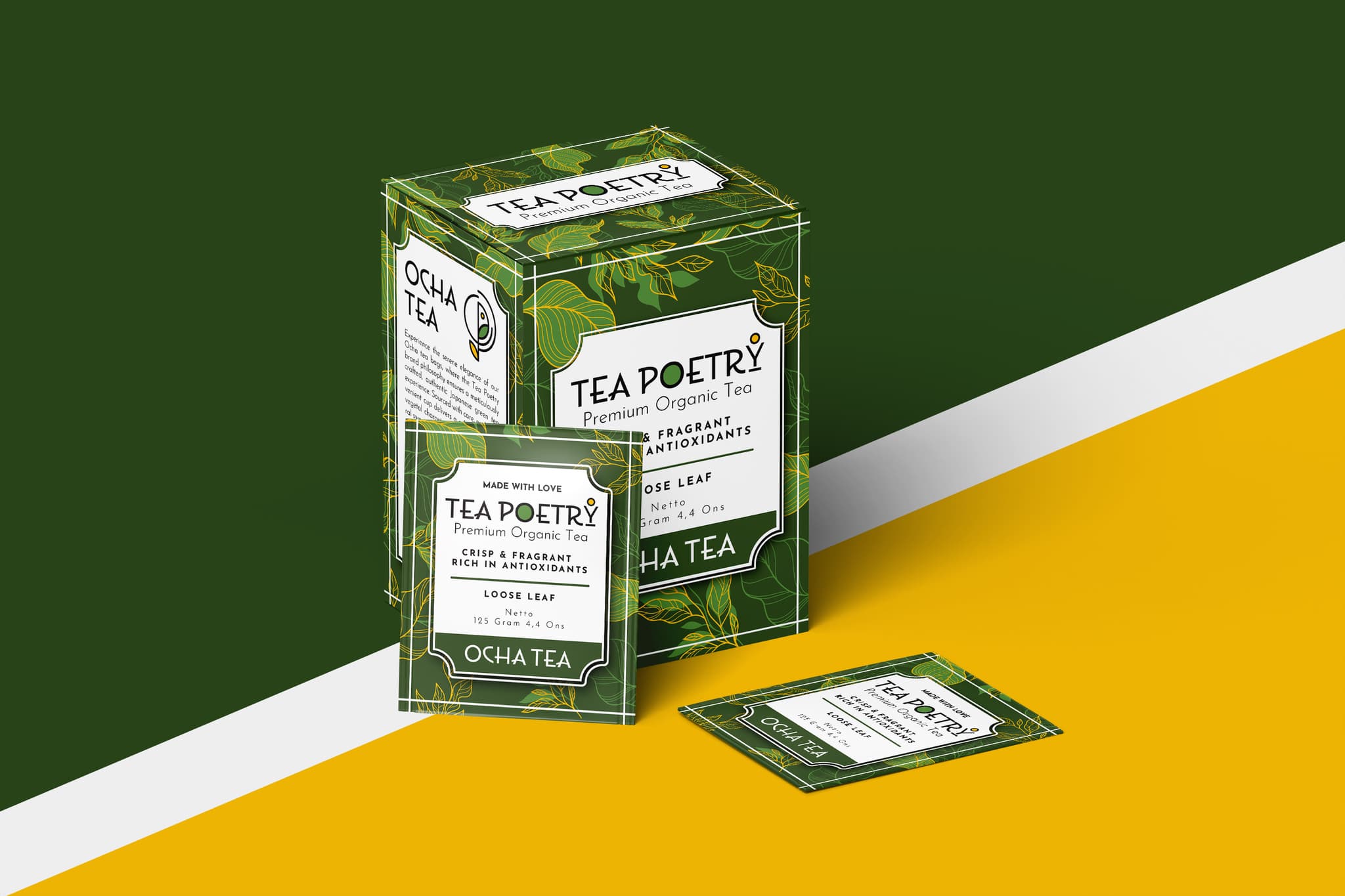
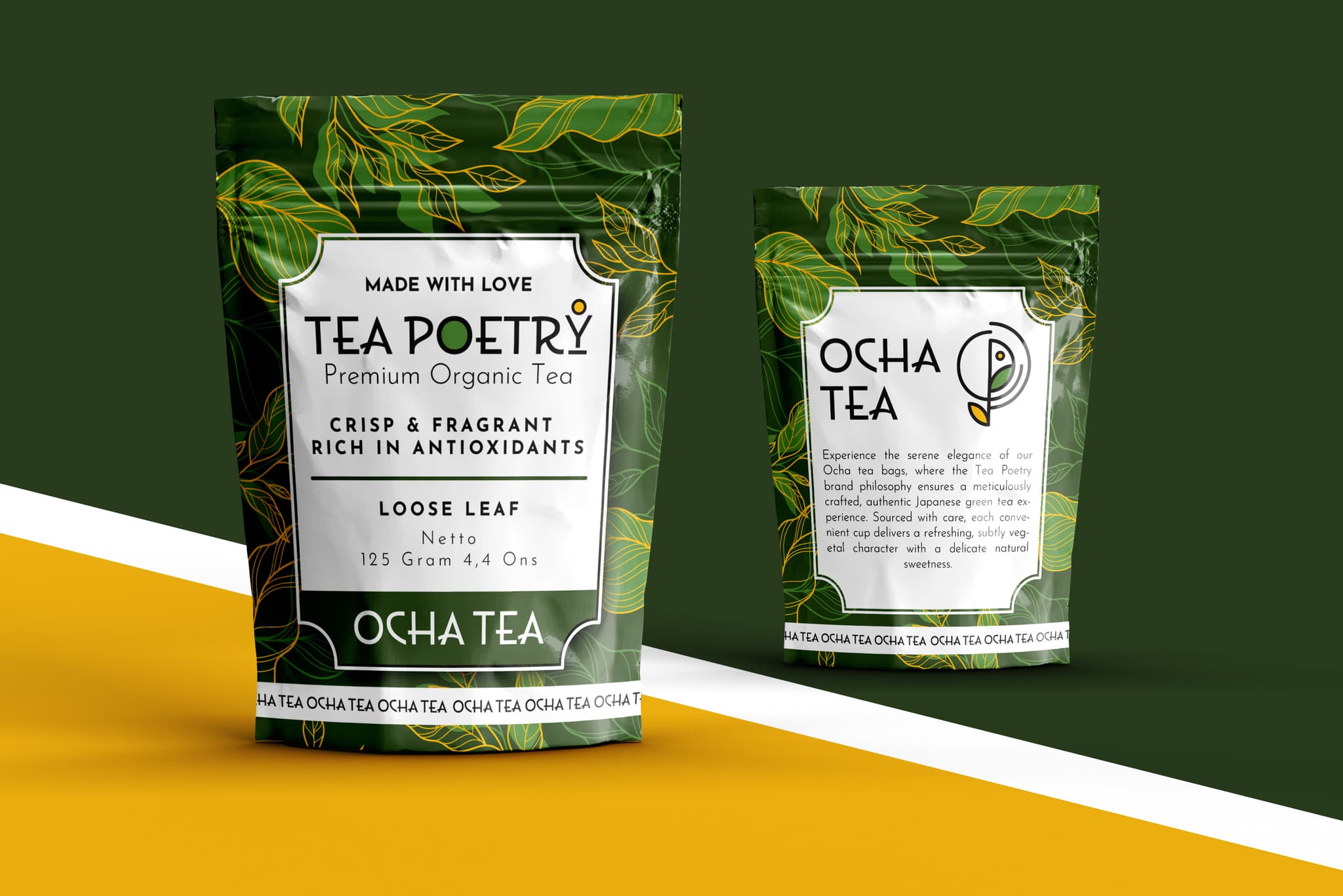
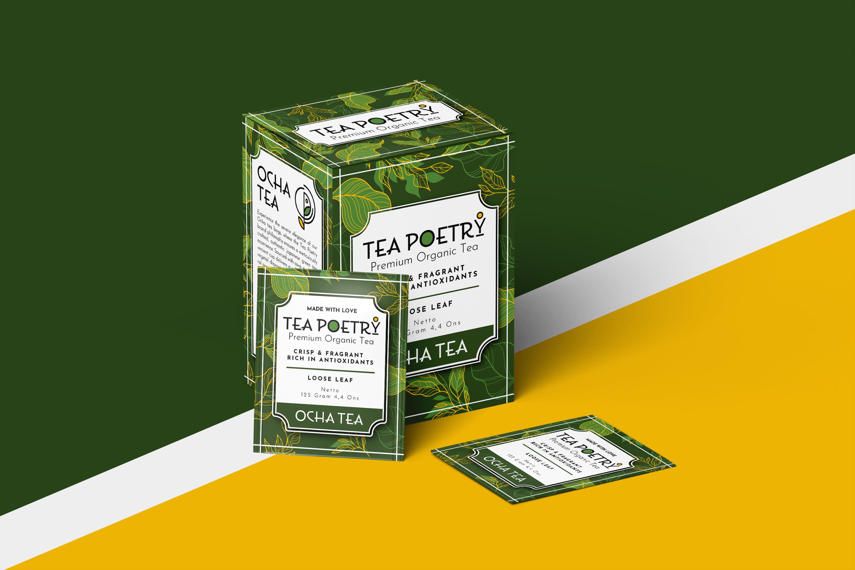
To start, the vibrant green color palette was chosen to evoke freshness, nature, and vitality — key qualities that Tea Poetry wanted to emphasize. The green, associated with organic and high-quality products, speaks directly to the tea’s fresh and pure ingredients, offering a natural appeal to health-conscious customers. A complementary yellow accent was added to inject a sense of warmth, positivity, and energy, creating a balance between nature and modernity.
The leaf patterns wrapping around the packaging were inspired by the brand’s commitment to using only the finest tea leaves from premium gardens. These delicate yet intricate designs provide a visual cue to the natural origins of the tea, aligning with the company’s values of sustainability and authenticity. The patterns are subtle, keeping the design clean and minimalist while reinforcing the organic and fresh essence of the product.
The typography used for the Tea Poetry brand name is bold, clear, and modern, ensuring it stands out on the shelf. The typography was chosen to convey both quality and simplicity, capturing the youthful, easy-going spirit of the target market while maintaining a premium feel. The inclusion of the product’s specific attributes — “Premium Organic Tea,” “Crisp & Fragrant,” and “Rich in Antioxidants” — clearly communicates the quality and health benefits of the tea, providing customers with the necessary information in a straightforward manner.
The Ocha Tea product name, prominently displayed, resonates with the target audience by evoking a sense of tradition, while also keeping the overall design fresh and easy to relate to. This blend of modern design with classic elements ensures that the packaging feels both trendy and trustworthy.
Ultimately, the Tea Poetry packaging design is all about creating a visually appealing product that not only attracts the attention of young, modern consumers but also reflects the brand's promise of providing convenient, high-quality tea. The use of vibrant colors, minimalist design, and subtle details makes the product stand out in a crowded market, while staying true to the brand’s core message of offering an exceptional tea experience in every cup.