Logo Design - Zenith Record
The story behind the Zenith Record logo is all about capturing the vibrant energy and rebellious spirit of youth, especially those who love to express themselves and stand out from the crowd. We knew our target audience craved authenticity and a connection to something real in a world dominated by digital. Vinyl, for them, isn't just a format it's a statement.
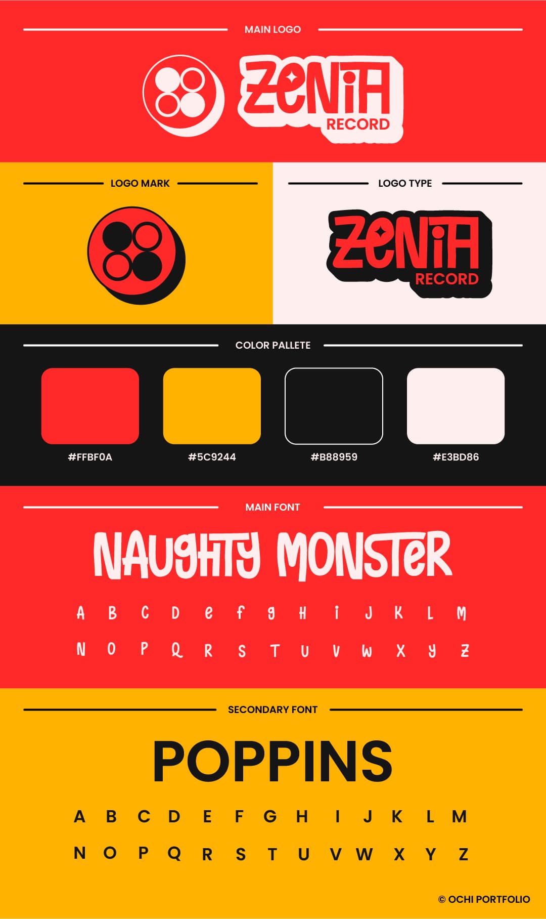
The "88" in the logo mark isn't just a number; it's a visual representation of two intertwined records, symbolizing the deep connection between music and the listener, and the endless loop of discovery that comes with collecting vinyl. It also subtly nods to the idea of "infinity" in music – a timeless passion. The bold red and yellow color palette was chosen for its raw energy and youthful defiance, immediately grabbing attention and exuding confidence, just like the young people Zenith Record aims to serve.
Finally, the "Naughty Monster" font for the main logo type was a deliberate choice to infuse a sense of playful rebellion and individuality. It's not a sterile, corporate font; it's quirky, memorable, and speaks directly to an audience that values unique expression. Combined with the grounded "Poppins" for secondary text, it creates a balance between playful creativity and clear, accessible information. This logo isn't just for a vinyl store; it's a badge for a community that lives and breathes music, and isn't afraid to show it.


